Popular Posts

Monday, January 31, 2011

farrow + ball announces their new colors- or is it colours.


You know you're a total interiors geek when a product, like paint, absolutely thrills your every sense. The UK based, Farrow + Ball has  been the industries leading producer of the highest quality, eco friendly paint for some time. What makes it so different? Why do I get your basic, Stendhal Syndrome from...paint?


From my perspective, having a fine art background,  the pigments that are used are so pure that depending on the light in the room as the day progresses, the different facets of color, change with the light. Cheaper pigments, don't give you this quality or experience.  I'm not even sure that photographs do the paint colors justice.


If you haven't seen a Farrow + Ball paint, in person, it's well worth ordering a few sample pots or stopping by a showroom. Their newest line { complete with the quirky names, they're known for } has something for every room. Premiering today, they add a list of mellow hues and a few zingers....


From the bright orange of "Charlotte's Locks" to the mellow gray green of " Mizzle " - the british term for that gray, drizzle weather.


So that's the paint. But  Farrow + Ball also has a line of wall papers that are made to match with the paints. The patterns are traditional and chalky in finish.


Rosslyn wallcovering


The hand made artistry comes through in the block printed patterns and stripes and striés that are trough printed. 


I recently had the opportunity to see a job in progress by a seriously talented L.A. designer. The designer had used this  {Rosslyn }wallpaper in a powder room. It was so impressive, like walking into a gallery { minus the toilet sitting in the corner } that I didn't care about the vintage light fixtures or any other details of the room. really, it's that sort of experience.


not the bathroom I told you about,  but even this shot gives you an idea of how gorgeous it is. found here


St. Antoine wallcovering


Lotus


And for a look at some seriously chic interiors using F+B's Downpipe {one of my all time favorites} check out the portfolio of Abigail Ahern. She did her { can't prove that this is her flat, but it's rumored to be } entire flat in the dark grey color.


Friday, January 28, 2011

peace out


I ran across this photo, and realized that it was taken right down the street. In 30 + years, not a lot has changed around here. Have a great weekend and if you're at the beach, get out there and enjoy this summer in January weather we're rocking.

Thursday, January 27, 2011

This Week on the Skirted Round Table:: rue magazine founders, Anne Sage + Crystal Gentilello


 To be truthful, I've had a lot of questions batting around in the dusty old belfry, regarding digital magazines. Are they really the next 'thing'? How will people remember to go back and look at them over and over when it's not sitting out on the coffee table. How will they promote themselves and stay talk worthy? How will they continue to get contributors to do work gratis? or what's the business plan? Bottom line, how will they fare over the long haul.


well, we asked the founders of the tremendously successful, and creative magazine, rue  some of these questions, and they answered. We learned, that this is as much of a labor of love as it is a business venture. Anne Sage and Crystal Gentilello,


RUE co founder, Crystal Gentilell

answer our questions with such conviction and passion, you'll be inspired.


I was especially taken by their fantastic partnership. From my experience, a good business plan with a partner, isn't worth anything, unless you treat the partnership like a marriage. One needs to champion the other and know where one's weaknesses and strengths are.


RUE co founder, Anne Sage


These women, are great examples of this theory and if you're like me, you'll walk away knowing that they're here to stay. Which is a win-win for all of us. Join us on The Skirted Round Table.


and don't forget to check out the newest issue of rue


painter :: abbey ryan

It's a well known fact around the blog world, that trying to claim exclusivity on a post subject....is just nothing short of boorish and makes one look a fool.


So, I was thrilled when I heard that fellow blogger, Oprah, featured painter, Abbey Ryan on her blog.  I, actually,  featured Abbey's work here...........almost 3 years ago to the day.


Abbey is one of those prolific, 'Painting A Day' artist who disciplines herself to crank out beautifully executed still life works, daily. {I tried this once and made it one day} Most of them food oriented. I'm so happy that Oprah picked up on my post because I think Abbey may get a few more hits now. You can re-post this, too if you'd like. I'm cool with it.


read, blogger,  oprah's post here


and view Abbey's work here

Tuesday, January 25, 2011

navy + swiss dot, swirly skirt


I'm thinking: game of croquet in the back yard, bare feet in the cool
grass, the smell of the grill and the sun setting at  8 p.m. ya. 


{ and oh so cute mixed with the hottest closet staple of the season, the french striped fisherman's sweater }


found on etsy. of course

illustration::clare owen


Chanel Ballet Pumps.


the charming illustrations of UK based artist, Clare Owen


xo


French Essentials.

The ladies adventure.

Monday, January 24, 2011

the falling garden::gerda steiner + jörg lenzlinger

 a beautiful concept to begin your week.....


 or make you ball your fists and purse your lips in jealousy. 


every aspect of this is absolute genius.


conceived and executed by Swiss artists gerda steiner and jörg lenzlinger, the falling garden was created for the 50th venice biennial in 2003. It was housed in the church of san stae on the grand canal.


visitors lie on a bed, above the doge's tomb, in the middle of the church and watch, as the garden thinks for them. the idea that modern day artists have collaborated with 17th century architects is staggeringly brilliant. The light, the angles...everything about the space is glorious even before the garden.


and with the installation,  the viewer becomes part of the art as it dances and dangles around them.


Components: Plastic berries (India), cow pads (Jura), waste paper
(Venice), baobab seeds (Australia), beech, elder and magnolia branches
(Uster), thorns (Almeria), nylon blossoms (one-dollar-shop), pigs’
teeth (Indonesia), seaweed (Seoul), orange peel (Migros shop),
fertilizer crystals (home grown), pigeons’ bones (San Staë), silk buds
(Stockholm), cattail (Ettiswil), cats’ tails (China), celery roots
(Montreal), virility rind (Caribbean), wild bore quills (zoo), banana
leaves (Murten), rubber snakes (Cincinnati)...

Friday, January 21, 2011

peace out


 photo:: vookie


I'm chaperoning a field trip to a California Mission today, you should go do hand stands with friends in the ocean. It's good for the soul, I hear.

Thursday, January 20, 2011

green design


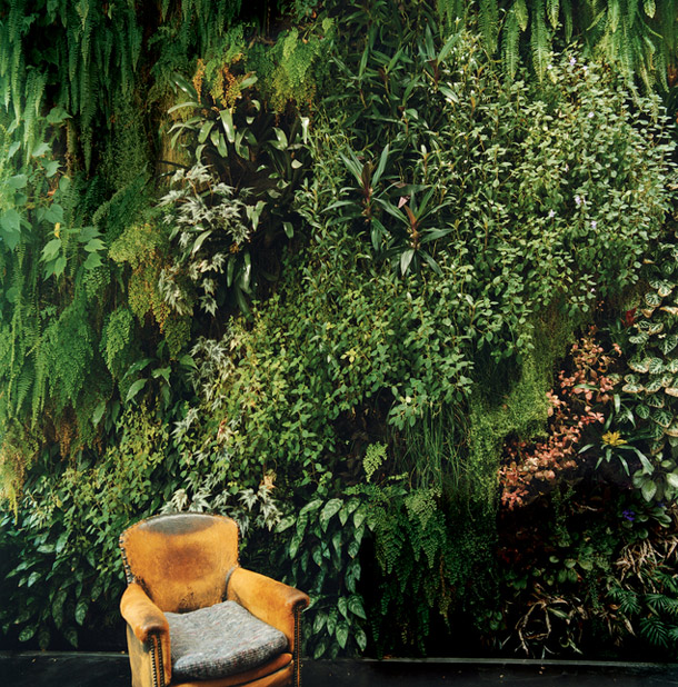
You know it smells like dirt right when it begins to rain {which I love}


Botanist, Patrick Blanc,  creator of the Vertical Garden  has been creating these forest floors, turned sideways all over Paris and abroad. Blanc's work can be seen {for my friends in SF} at Drew on California and here in LA at La Bastide restaurant.

Tuesday, January 18, 2011

luck outs.


Where do these bloggers live that they're always stumbling across things like, these Dorothy Draper-esque Espana chest for anywhere between Free dollars and $13.00 dollars? I never, ever have such luck. 


quirky + delightful digs of the Santo Domingos


The NYC  apt. of Vogue contributing editor, Lauren Santo Domingo has all of the elements that make me, swoon? uh. no. not really the 'swooning' type. 'jealous'? nah, too catty.  'envious'? ya, probably, more like it.  


Located in the urban environs of the  Flatiron district the space has
that strong utilitarian flave that I will never get over wanting, 
filled with a mix of high end + low end quirky finds.


 Among the great works of 20th century artists { Salvador Dalí, Hans Bellmer, Aaron Young, and Max Ernst } sits this Lalanne Hippo....... It's A HIPPO THAT TURNS INTO A BAR. kind of makes a bar cart look sissy and ordinary.


This might be one of the  best uncurated/curated bookshelf I've seen in a long
time. Not a color blocked set of books in the lot.  A boom box and a Santeria candle: Never take it all so seriously
that you forget the humor and can't find interesting design in the
mundane.


Remind me to put my office in that walk-in dressing room
I'll have one day. I could hide forever, completely undisturbed in
silence. Also, remind me that I need drawers like this.....


 Oh, I how I love a home filled with rooms that continue to open up the more you stand and observe.