Popular Posts

Tuesday, June 29, 2010

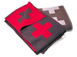
when heaven meets earth- The Crux Blanket


It's the Birkin bag of blankets, really. Beautifully made, a classic, works with any room/outfit, too much for me to reasonably talk myself into buying....and you've got to take a number and stand in line if you want one.


home of designer::Frederic Mechiche


and I'm not sure that I will ever stop wanting one . Behold the beloved, Crux Blanket by Pia Wallén:


photo:: inside out photo credit:: pia ullin

Of Impeccable craftsmanship and quality, it's made using traditional Scandinavian methods { by a small family owned company in Sweden } and the finest wool.


home of designer:: Orla Kieley
Every year, a new color is added.
Also, the price is over $700.00 per. So there's that small detail.

photo:: hus and hem photo:: Chris Stubbs for Skandium

Which brings me to wonder, why hasn't West Elm knocked this off? I mean, Pottery Barn had no problem knocking off Madeline Weinrib a few years back.
Why not crank out some version of this? Hell, sell it on Canal Street in a crinkly plastic bag. But you'd have to be ok with bad proportion/color/material and draping yourself in someone else's bad ju-ju.
But, would you buy it? Honestly?

photographer:: Alexander Crispin for Scandinavian Style

In Swedish folkart tradition, the cross is a strong symbol for hope, a meeting point of heaven and earth. I wish I could say that made all the difference for me.

photo credti:: hus and hem
But really, it's just about the great design and artisan quality that goes into each one. And I really, really want one. big time.


in orange.


Monday, June 28, 2010

This Week on the Skirted Round Table::

What was this man doing in my bedroom and what does it have to do with design?
find out on this week's Skirted Round Table.

Friday, June 25, 2010

peace out

photo credit:: Sandra Goroff

It's finally summer.
Yesterday my youngest and I sat at the beach and watched as a Sea Lion body-surfed so close to shore that we could see his whiskery muzzle.
Tonight we'll be back down there, enjoying our first of many, summer-beach-dinner-party. god, I love summer.

Thursday, June 24, 2010

beach day

Not at my desk today. But if you want to hang out, you can find me here:

Wednesday, June 23, 2010

Flagging Down ABC Carpet & Home


Gorgeous and patriotic. Great, one of a kind Turkish Floor Art inspired by the creative spirit and the interpretation of the American Flag. A good thing just getting better.

What a great twist to the already beloved, eco-friendly, bleached and dyed, vintage, Turkish Artisan rugs that ABC has been carrying for some time. {I wrote about them here }

Beginning tomorrow- 6/24/10 ABC and Gilt Groupe will be hosting an exclusive sale of limited-edition, one-of-kind patriotic rugs using incorporating these pieces.


"ABC commissioned the group of artisans from a remote village in the southern mountain region of Turkey to create the American flag without any creative direction or reference materials. The artisans were given an assortment of textiles, denim and vintage carpet remnants in a wide variety of colors, patterns and textures. Each rug was hand-constructed using traditional quilting methods."
Show your pride and shop the limited-edition PROJECT AMERICANA sale from ABC Carpet & Home Thursday, June 24th exclusively on GILT.com

Tuesday, June 22, 2010

the bomb. dot com


I haven't any clue how I originally stumbled upon this Japanese site, 'Mahna Mahna Factory' but I keep finding myself going back to just look. I mean, 6 " Disco Ball Shoes? A band leader's hat? It's like stumbling across the best yard sale ever. visual jack pot. mahna, mahna.

Monday, June 21, 2010

digitally mastered


When my brother was a kid, one of his bedroom walls was covered with a huge, grainy, black and white photograph of a 747 on a tarmack. The graininess of the photo created an almost pixelized design up close, but from a far {10 feet back} it almost felt as though you should have a lighted baton in each hand, directing the plane to the gate.

I was always a little envious that he had such cool walls and it has forever sat in the back of my mind {the internal design lab portion of my brain} as a, someday-somewhere-I'll-use-this, idea.


I have no idea where my father found that gigantic poster/wallpaper, but in the mid - 70s I don't think it was being digitally produced and most likely wasn't something easily accessible outside of the trade.


These days most digital print shops will recreate any image you give them on to paper or even canvas. For those a little timid about swathing the entire length x width- an enormous canvas can have great impact.


I keep thinking about the Eames 'House of Cards' . Some of those would be really fun on a playroom wall. If not used as wall covering, try them as a triptych using huge digitally printed canvas.


How about this one....

makes my skin crawl a little but perfect for a science lab.
Palate cleanser......


above photo:: Jeffrey Hirsch for New York Social Diary

One of my favorite boy's rooms is that of the son of photographer, Pieter Estersohn. Estersohn used one of his own photographs of a temple in India, digitally blown up, to create this stunning room.

The room itself is quite small yet the impact and depth of the photograph, visual creates space. The subject is so elegant, couldn't you see this in an woman's dressing room?
photo credit:: Pieter Estersohn


A few technical details: original images need to be at least 150 dpi and the cost runs around $5.00 per square foot.

Friday, June 18, 2010

peace out


photo credit:: alice b. gardens


Happy Father's Day, daddy. I hope you know the depth of my love, respect, admiration and appreciation for all that you've done and given to me.
{ Life is short, too short. Hold the ones you love tightly and enjoy the ride. }

xoxo, 'Meg'

Wednesday, June 16, 2010

Blog Out Loud 6 >>NYC the ReCap


wow, what a whirl wind trip that was. 72 hours and I'm back from Blog Out Loud NYC- so filled with inspiration and blog love. GOD I love the world of social media { I'm like a girl with a crush, all dreamy and happy }
After taking the red eye Saturday night, getting into my friend's apartment and taking a quick nap, I was awoken by TartanScot's text message, 'wake up!'

A quick run of the comb through the hair, wash of the face, reapply of lip-age, it was off to Sunday Brunch at The City Grill on Columbus followed by, Gelato in Central Park {he} a street vendor hot dog with kraut {me} and an attempt to wade through the mayhem that was the Puerto Rican Parade.
Already, 2pm and we realized it was time to run 'home', ready ourselves, and reconnect for the NYC design tweet up, organized by the BKYLN Contessa and held at the Cooper Square Hotel { a beautiful little boutique inn check it out}
The very adorable Jessica Schroeder of What I Wore blog, with Scott and me.
The evening ended early with a meal at the Fatty Crab {some of the best flavors to be had in the city}

............................. Monday ..............................

After running around Monday, grabbing up all of the loose ends {wine, fruit from the Union Square farmer's market } for the impending event, we headed over to the very cool space of Tonefarmer
{ I just kept fantasizing about living in this space. Isn't it so great ? }
........................ 7:00 pm ....................
Goody bags filled, wine poured, seats set up, Rebecca and I were ready for the guests and panelist to arrive.


Bite sized decadent treats were donated by Brooklyn based, Fanny & Jane these are Red Velvet bites dipped in chocolate. { Uh, what? That's just ridiculous. }
The interesting thing is how each of these events have taken on a unique personality. Every event that we've thrown has been so inspirational and filled with new friends and each, in its own sense, just amazing, but it's the panelist and the audience that really create, the true spirit of Blog Out Loud. This group was smart, witty and so saavy.

The panelists: Meredith ebay's The Inside Source Amy abcd Design, Michelle When I Grow Up Coach, Rebecca Loving.Living.Small (moderator & Blog Out Loud co-creator/partner), Me , Alison Teenangster/etsy Storque & Erin Design For Mankind.

It was like musical chairs, 'grab a seat so you're sure to nab a swag bag folks!' we ended up with standing room only attendance -thank you, to those in the way back.

And so, we raise a glass to another successful event. Thank you to all, who attended, sent well wishes, shared your experiences and knowledge. This can only get better and better.
Join us on facebook, twitter etc, let us know where you'd like to see Blog Out Loud happen next and if you'd like to become a partner/sponsor in our upcoming Blog Out Louds, give me a shout.

Friday, June 11, 2010

peace out


kind of feel like I've been M.I.A. this week, with all of the plans going into my upcoming NYC trip and Blog Out Loud event.
The fabulous, Brooklyn Contessa will be hosting a lovely get together Sunday night and my dear friend, the super dapper, Tartanscot will be in town. bonus.
and I know you're so disappointed that I haven't been blogging my outfits, but I'll save you the nail nibbling, for the record: I'll be donning, beach duds. Casual, jeans - a purse way too slouchy to be chic and maybe not even heels. Yes, even in the city, I'm still L.A. beaching it.


Our rsvp is now closed, because we've had such a great response. I have a feeling we'll be back though. But for those of you coming Monday night, can't wait to meet you, so glad you'll join us. We have a great line up of panelist:
Erin Loechner @designformankind,
Amy Dragoo
@abcddesign,
Meredith Barnett ebay blogger @theinsidesource,
Alison Feldmann Etsy Blogger@teenangster,
Michelle Ward
of When I Grow Up Coach @whenIgroupcoach.

really, who doesn't heart new york...big time.

Thursday, June 10, 2010

If walls could talk- the braying of a legend


...running around finalizing the details of the Blog Out Loud NY event. Being in the NY state of mind, I remembered that I had recently read in The New Yorker, that the famed Upper East Side, Gino of Capri restaurant has served its last supper and closed its doors, due to a rent increase - a reported, 8k a month, not including tax.

look how shiny. Is that grease? or did they just keep coating a layer of shellac every year?

The restaurant known as being a '1940s time capsule' among other things, was probably best known for its signature, red, zebra covered walls. Gino's was the impetus for the now classic, zebra pattern wallcovering created by Franco Scalamandre's wife Flora specifically for the restaurant, as a way to help out the newly immigrated restaurateur. I wrote about it a few years ago here.
So what's to become of the old joint? West coast cupcake juggernaut, Sprinkles, is taking over, claiming that they'll keep the frolicking zebras. Which, yay. more over priced cupcake shops.


In case you missed these:

Kate and Andy Spade's super, snappy, zebra-in-green bathroom.

And making a cameo while Margot, is sneaking a smoke.

Wednesday, June 9, 2010

Thank you NEST interior design....


Seriously, I was so flattered when Designer Beth Dotolo, asked me to be a part of her ' Design Inspirations' post , regularly published on her awesome blog, NEST Interior Design.
The list , alone, of those who have preceded me has me feeling honored to be a part.
And she's just so darn nice { plus she totally gets my love of Wilco }. I mean who doesn't get a bit misty when someone just randomly, reaches through the blogasphere and gives you a pat on the back. Hugs and Squeezes, Beth. And Thank you. You can read the interview **here**

Tuesday, June 8, 2010


I just got home from a weekend of sultry heat in the midwest, visiting family, getting the little cousin girls together for fragrant, cricket filled, night-rides on scooters, firefly chasing, trips to the ice cream store and all of those 'normal' summer activities that take on a certain storybook enchantment when you grow up in an urban beach environment.
I'm hittin' it running. I've got a fantastic event planned next week in NYC { blog out loud, NYC bay-bee! } So my postings will be light this week as I wrap up the final details on that.
From my virtual cigar box of trinkets and treasures, feathers and seashells, my file of miscellany:

The perfect, New Hampshire, Maine {insert favorite remote, beachy place here} summer house kitchen.

Isn't this about the most charming, summer house beach kitchen. I want to think it sits somewhere remote and those who use it, open it up every summer, removing the drop cloths from the furniture, wiping the salt from panes of glass, opening windows, sweeping the floors and readying it for a long summer of tan bare feet, shell seeking and lobster cookouts.

Friday, June 4, 2010

peace out

photo cred:: jena ardell


Hope you have great things planned for the weekend. Or possibly nothing at all {which are sometimes the best weekends ever} I'm off to the midwest for a little hot and sweaty summer time fun.
Be back on Tuesday and hittin' it into high gear for Blog Out Loud NYC. If you're in town, we hope you'll join us.

Thursday, June 3, 2010

white floors


credit:: Jonathan Adler, Living Etc June 2008


rhetorically speaking, what would happen if I painted my floors white.
I've been thinking of doing it ever since, well, ever since I painted them dark brown.
And then I stepped into my friend Karla's shop , Patio Culture and it sealed the notion.


But would it feel too 'cold'. Which is not a bad thing on a hot summer beach day.


credit::Living Etc
But then what's it like during those cool winter months when it's dark at 5? Would it feel too austere? too antiseptic?


show dirt and dog nails like a mother trucker.

Maybe not white but bright....
This shot from 'Martha' seen round the blog world, for good reason, has always seemed like a good dare.
But then, so does this sensible serene middle ground. It seems safer:


This one's clearly still in the incubator. In the mean time I'll stand at a good vantage point, chin between my thumb and forefinger, eyes squinted, trying to wrap my head around this 'dilemma'