Popular Posts

Wednesday, February 29, 2012

De Pendant

 I haven't a clue how I stumbled across the woman's blog. But I'm glad that I did.


 Once I got in to it, hit the 'previous post' button a few times, my eye was drawn to what must be one of her favorite types of lighting as well- the over-scale industrial pendant light.


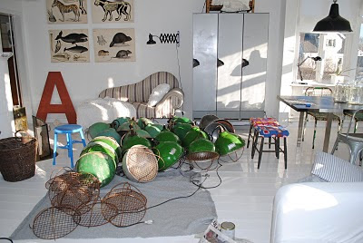
There were probably far more than what I snagged from her site, but I like that with so many shots, it gives you great inspiration as to where and how such a fixture can be used. 


Don't these look like they just hatched all over her floor?


The clean austere black finish lends a serious tone to what appears to be an old utility porch turned kitchen. (love that ceiling and the cord)


 The metal, basket is a great design element. I'm not sure what purpose it serves.... except to sit there and look cool.


Ah. I mean, who doesn't love a pop of any bright color just to shake things up? This must be the other side of that fore mentioned room with the black pendant. (smeg. love the name. love the fridge)


ok, one more shot of the room. That window is fantastic, isn't it?


 I know this about the pendant but don't you love a good, flag-as-decoration moment?


oh and also, she featured some kind of a swedish, summery desert yule - loggy thing. Doesn't it look delicious? I don't know what it all says, but I suppose I could hit 'translate' in google. But there's something even more charming seeing all of those umlats and ikea words all over my computer. 


here, go take a look for yourself: in-myhouse

Tuesday, February 28, 2012

The wonderfully weird world of Ibride. ( And, also, I get to use the word, 'phantasmagorical'.)


Years ago I blogged about this collection of trays by Ibride which creates these fantastically phantasmagorical images and applies them to houseware products. I stumbled across some of their newer pieces from the Yuan collection, and was instantly drawn in again. 


The images remind me of a Lewis Carroll Alice In Wonderland world - or those Victorian Fairie (spelled just like that) photos. They're just, wonderfully weird.


 I especially love this collection: 


They come stacked, 8,  in a vase.


 Each plate, if you look closely, bares a little surprise creature.  They're made of Melamine  and are dishwasher safe? Perfect for a little garden party or wouldn't these be beautiful hung on a wall as art? 

Friday, February 17, 2012


Takin' a little vacay., being it's "Ski Week" and all. 
I know Boston has 'Ski Week' or 'Winter Break'.  Does anyone else? Seems a little ridic.  We always scoff a little at the concept - and then go back to packing (these kids just had off 2+ weeks  and a few random, 3 day weekends ) Living at the beach we can't leave well enough alone,  we need SNOW and WINTER. Even it will be mostly man made


So off we go! 


Have a lovely weekend, where ever that may be.


Wednesday, February 15, 2012

This Week on The Skirted Round Table :: Joe Lucas + Parrish Chilcoat of Lucas Studio Inc. + Harbinger


 After a bit of a hiatus (due to everyone's busy schedules) Joni, Linda and I are back! And what a great interview to be back with. A few weeks ago, we sat down with the talented, charming and down to earth design duo behind Lucas Studio Inc. and the newly opened, Harbinger showroom, Joe Lucas and Parrish Chilcoat.


Known well among the design glitterati of L.A., these two are anything but 'glittery'. They're design aesthetic is California hip mixed in with East Coast tradition and spiked with a dash of creative elegance that rings, 'Lucas Studio' the minute you walk into a room. I for one, love everything about them and was super excited when they agreed to come have a chat with us at the 'round table. 


If you haven't been, their showroom, it's a must see.  Harbinger (which cannot be missed by its Pink front doors ) takes its place along side of other noteable LA designer showrooms such as Peter Dunham,  Suzanne Rheinstein and Jane Hollworth. Make sure you put aside at least an hour. There is so much to see and be inspired by in their new space. And of course, if Joe and Parrish are in, say "hello", as they are so gracious and such a pleasure to know.


In the mean time, come on over and sit with Joni, Linda and myself for another, Skirted Round Table chat.

Tuesday, February 14, 2012

A Whitman's sampler of stuff I like to look at + think about.


from the remodelista


Just an idea that I thought was kind of cool. Pot hanger as herb keeper (herb or HERb, if you're Martha) so pretty + probably smells fantastic. 


 My love for old houses runs very deep. I think I may have some kind of house whispering skills. When I'm in certain, soulful houses, I feel their soulful presence on an emotional level. I know, totally weird, but true. I want to drink this book in. And I think all old houses deserve a pictorial like this.


etsy driftwood napkin holder


 Great idea. Nothing more. Just, simple, organic and so clever.


The Curiosity Shoppe -Stamp of disapproval


The stamp made for my own forehead.


Casa Cher by BAK Arquitectos

 I don't know why I'm on this uni-bomber-shack-love kick. I'm just really drawn to these small, modern spaces that are sparse and sit nestled into nature. But, I would need curtains, black windows like this at night, make me feel creepy and vulnerable.


Nick's getting this as a Valentine's gift. (he doesn't read my blog, so I'm not really spilling anything)


Mara Hoffman Hooded Backless Fishtail Gown


ok, GOR-GEOUS.  hooded + backless (how that works, I don't know) + fishtailed. Spanx me up and hand it over.


duh. this is such a better approach to the mundane, criss-cross.


that

 is all. 

Monday, February 13, 2012

illustrator::anne-marie jones


I'm DYING over the art of Anne Marie Jones. I have such wanna-be-itus of her work. I love the courage and confidence behind the each stroke and color load of her brush. fabulous.

pattern genius:danielle kroll


Many years ago , I fiddled around in the world of textile design.  I freelanced for months at a time. I sold some patterns independently. Some of which I still see on occasion and point out to my kids - "Look! I designed that print!" others I see, and think to myself "enh, I got paid." ( think, Vermont Country Store night gown prints and TJ Maxx old lady Nighties ) 


When I was asked to do my very first Croquis for one 'fashion house' I panicked. I had no clue how to make a pattern that, when repeated, created a continuous pattern. Again, this was "many years ago",  and we weren't using Photoshop to "define the pattern". 


Or at least not in the art departments where I worked.  So I turned to amazon and purchased every book I could find on the subject. 


Anyway I figured it out eventually, and have forever had a special place in my heart for textile design.  Sometimes, when I need a bit of inspiration,  I like to stroll through the pages of illustrators who have pages devoted to their beautiful designs.


Among my "textile design" tagged bookmark sites, is Danielle Kroll's.


I love her quirky, vintage inspired patterns. The above being my favorite.


I'd take any of them in a nice Lawn Cotton blouse, a little girl's pinafore or as Wallcovering. They're simply lovely and totally inspiring.You can see more here.